
A complete hospitality-focused digital platform designed to strengthen brand positioning, improve guest experience, support multilingual audiences, and create a scalable foundation for long-term growth.
Industry
Hospitality
Scope
Strategy + UX + Dev
LANGUAGES
EN / DE
PLATFORM
WordPress
Verdo Hotel required more than a website. The goal was to create a premium digital platform capable of strengthening brand perception, improving guest experience, and supporting future business growth.
AbaSoft delivered a complete strategy, UX, design, development, multilingual architecture, and SEO-ready foundation tailored to the hospitality industry.
From strategy and UX design to multilingual implementation and optimization, Verdo Hotel was transformed into a future-ready hospitality platform.
Verdo Hotel required a digital platform capable of balancing hospitality branding, user experience, multilingual accessibility, and future business growth within a highly competitive market.
Creating a digital presence that reflects the quality, comfort, and professionalism expected from a modern boutique hotel.
Providing a seamless experience for both German-speaking and international visitors through a multilingual website architecture.
Building a platform capable of supporting future marketing, SEO, and business expansion initiatives.
The project required balancing aesthetics,
usability, technical performance,
and long-term business objectives.
AbaSoft delivered an end-to-end solution combining strategy, user experience, development, multilingual architecture, and performance optimization.
We defined business goals, target audiences, content priorities, and the overall digital direction of the platform.
A structured content hierarchy was created to simplify navigation and improve content discoverability.
User journeys, layouts, and visual interfaces were designed around hospitality best practices and guest expectations.
The website was developed using WordPress and Elementor with a fully responsive architecture.
Performance, multilingual readiness, mobile usability, and SEO foundations were implemented for long-term growth.
Strategy • Information Architecture • UX/UI Design • WordPress Development • Multilingual Implementation • Mobile Optimization • SEO Foundation
The website was designed to guide visitors from discovery to decision through a seamless and intuitive hospitality experience.
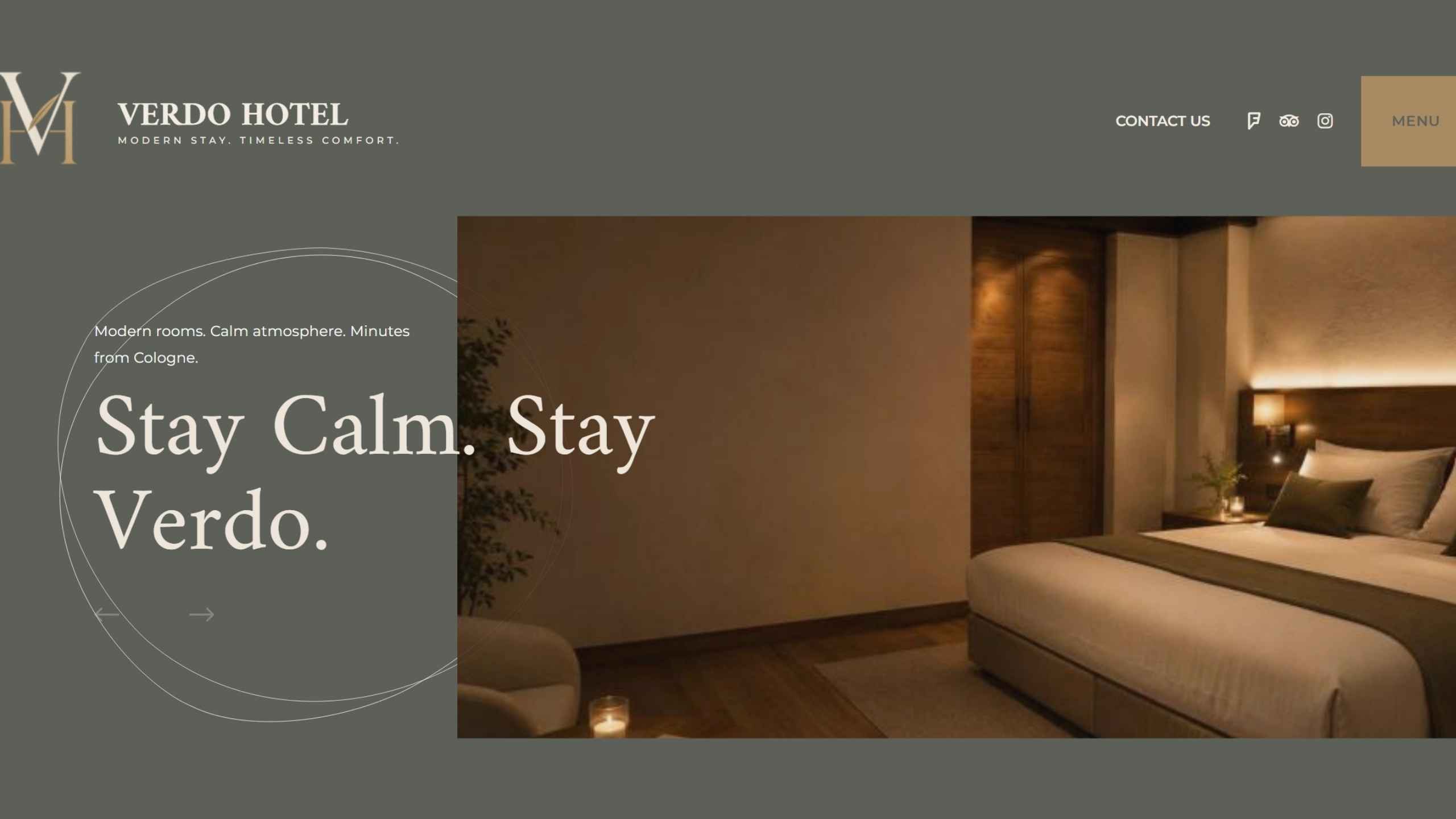
A premium first impression designed to inspire trust and engagement.
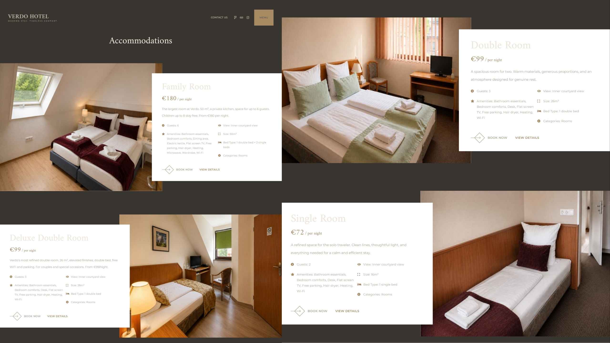
Comfortable spaces presented through a clear and intuitive experience.
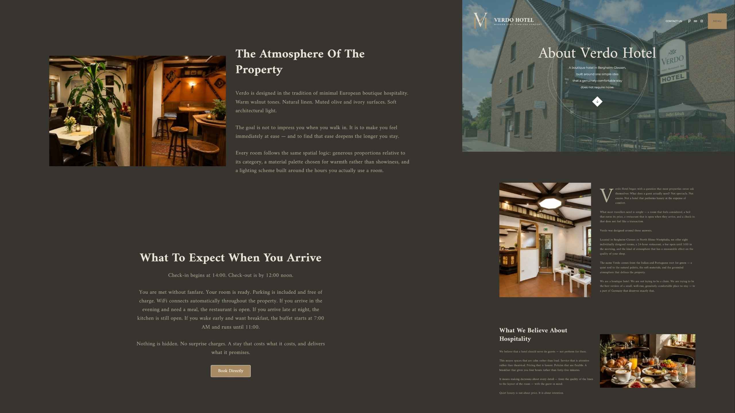
Communicating the identity, values, and character of Verdo Hotel.
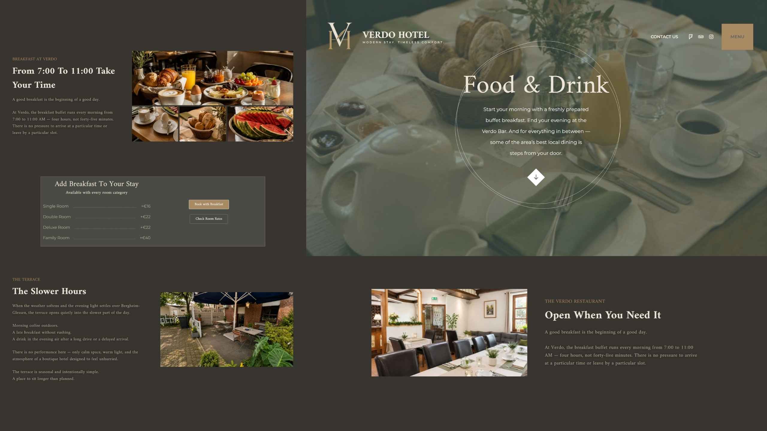
A refined showcase of the hotel’s culinary and hospitality offerings.
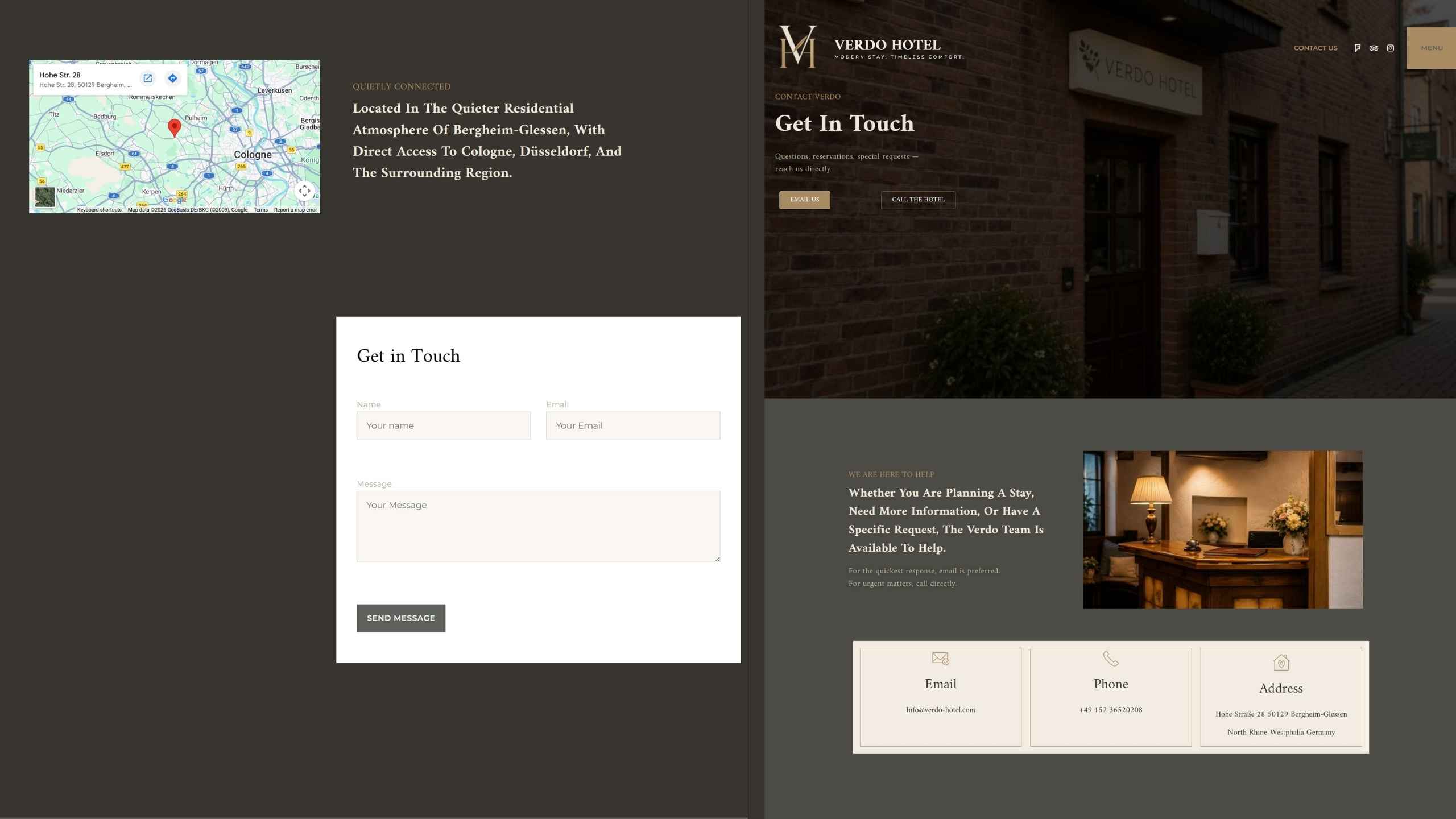
A streamlined path for guest communication and reservations.
Every page, interaction, and navigation path was designed to help visitors move naturally from discovery to inquiry.
First impressions through the homepage experience.
A structured content hierarchy was created to simplify navigation and improve content discoverability.
Discover food, hospitality, and guest services.
Understand location, parking, and directions.
Reach out or proceed toward booking.
The website experience was designed to reduce friction, improve information accessibility, and support faster decision-making.
The platform combines modern design, multilingual accessibility, responsive architecture, and scalable content management capabilities.
Optimized for smartphones, tablets, laptops, and desktop devices.
Designed for both English-speaking and German-speaking audiences.
Built with a structured architecture to support long-term visibility.
Dedicated room pages designed to support exploration and decision-making.
High-quality imagery integrated throughout the guest journey.
Flexible content architecture designed for future growth and updates.
Responsive Design • Multilingual Experience • SEO Foundation • Scalable Architecture
Designed for Guests on Every Device
The website was carefully optimized to deliver a seamless and intuitive experience across smartphones, tablets, laptops, and desktop devices.
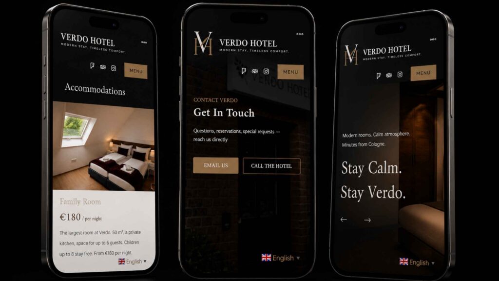
Optimized layouts designed for smaller screens.
Lightweight pages for faster loading times.
Clear and accessible navigation across devices.
A unified experience across all screen sizes.
Optimized for Smartphones • Tablets • Laptops • Desktop Screens